Airbills Pay
Airbills Pay is a Web3-based payment application that simplifies how users manage bills and utilities such as airtime, data, electricity, and cable subscriptions, while also integrating flight and hotel bookings which is an uncommon feature for mobile platforms in this category. The goal of the redesign was to elevate usability, visual harmony, and trust for both Web3-native users and traditional Nigerians exploring decentralized payment tools.
Client
Airbills Pay
DELIVERABLES
UX Research Mobile App Redesign
Year
2025
Role
Product Redesign
Overview
Airbills Pay is a Web3-powered payments platform that enables users to manage wallets, pay for services like airtime, data, and electricity, and even book flights and hotels—all in one mobile app.
I was brought in to lead a complete redesign of the app’s mobile experience—making it not only more modern and intuitive, but also accessible to both Web3 enthusiasts and everyday Nigerian users who might be using such a product for the first time.
The redesign focused on simplifying user flows, improving discoverability of features, and enhancing trust through better design clarity and usability.
Context & Problem
Context & Problem
Context & Problem
Before the redesign, Airbills Pay’s experience was functional but unrefined. While it served its purpose, it lacked a cohesive design system and didn’t properly address the differences between its two main user bases:
Web3 Users: Familiar with crypto concepts, desired flexibility and a sense of advanced control.
Everyday Nigerians: Focused on simplicity, clarity, and reliability—just wanting to get things done quickly.
In addition, the product team wanted to introduce flight and hotel booking, which is typically a web-based experience, into the mobile app. This required finding a way to make such complex processes simple and familiar within a compact interface.
The main issues were:
Unclear hierarchy and cluttered screens
Poor discoverability of services
Lack of design consistency and feedback states
Weak communication of brand identity
The goal was to create a seamless, unified, and inclusive mobile experience that feels intelligent yet approachable for all user segments.
My Roles & Responsibilities
As the sole product designer, I worked end-to-end—from understanding user pain points to delivering the final interactive prototypes.
My responsibilities included:
Conducting user and competitive research
Defining user flows and information architecture
Wireframing and prototyping
Designing high-fidelity interfaces
Conducting usability testing and implementing feedback
Producing marketing and promotional assets to match the product’s brand identity
Research & Discovery
1: User Research: I started with interviews and short-form surveys targeted at two key segments; Web3 enthusiasts already familiar with the platform, and everyday users who had used mobile payment apps like PalmPay, Opay, or Moniepoint.
Key Insights:
Regular users wanted a faster way to perform transactions without feeling “lost” in too many options.
Web3 users wanted a sense of control—quick access to wallet details, reversals, and transaction history.
Both groups agreed that mobile-based booking (flight/hotel) should feel simple and linear, with clear progress states and confirmations.
These insights helped me focus the redesign around clarity, accessibility, and contextual communication—ensuring both user types could complete tasks confidently.
User Surveys & Persona: From this research, I created two personas:
1. Tunde – The Crypto Enthusiast
A 29-year-old blockchain trader who loves efficiency and control. He wants to manage all payments and assets in one app, but needs speed and robust features.
2. Ada – The Everyday User
A 24-year-old content creator who just wants to buy airtime, pay bills, and maybe explore travel options. She values ease and clear guidance over complexity.
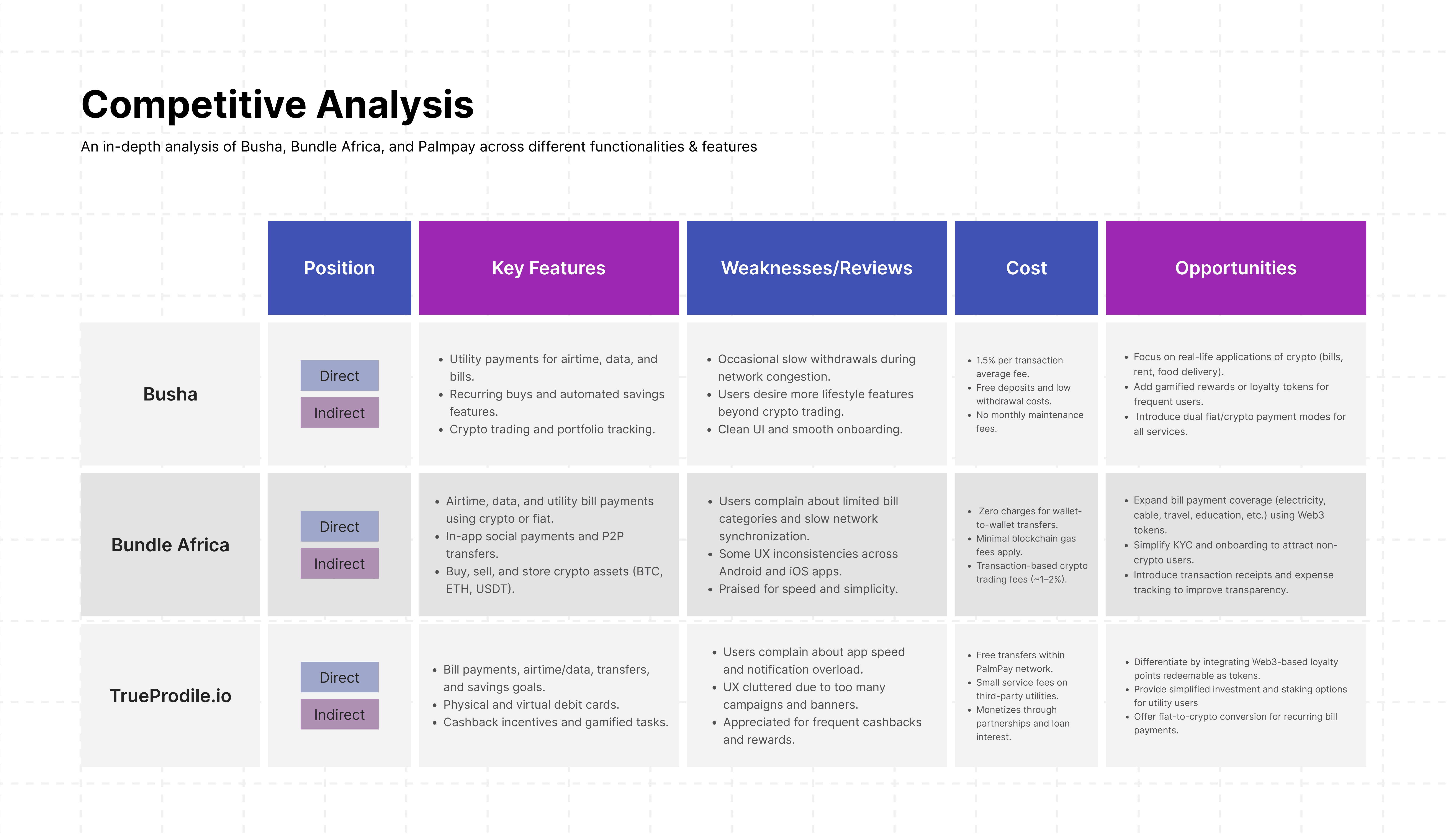
Competitive Analysis: I analyzed similar fintech and Web3 platforms like Bundle, Binance Pay, and PalmPay, identifying their key features and shortcomings:
Bundle: Great for crypto transactions but poor at bill management.
Binance Pay: Strong ecosystem, weak onboarding for casual users.
PalmPay: Excellent for local payments but lacks modern design language.
The insights from this analysis shaped the redesign strategy—to combine the intuitive flow of fintech with the sophisticated feel of Web3.
Wireframing & Ideation
I started my ideation process on paper, sketching out several layouts and navigation approaches to quickly test design directions.
Once I had a few solid ideas, I moved into Figma to build wireframe prototypes, which I used to test usability with non-Web3 users specifically. The goal was to observe whether everyday users could perform common actions like buying airtime or paying a bill without any confusion or extra guidance.
This rapid iteration approach allowed me to validate ideas early before investing too much in visuals, ensuring the app structure and flow felt natural and easy to grasp for everyone.
Information Architecture
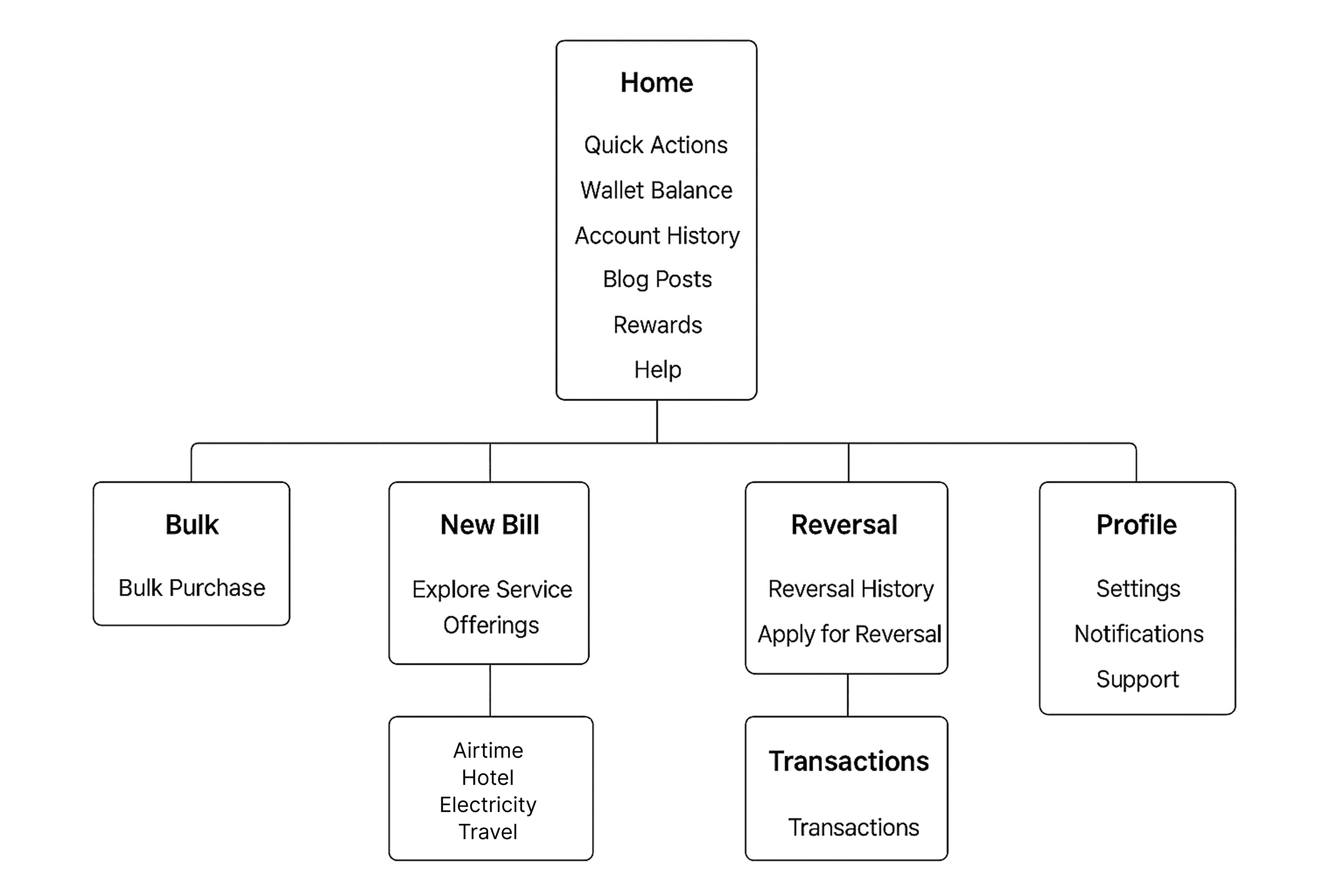
I restructured the entire app into five key sections that improved clarity, accessibility, and task orientation:
Home – A central hub for quick actions, wallet balances, recent activities, blog posts, and general account overview.
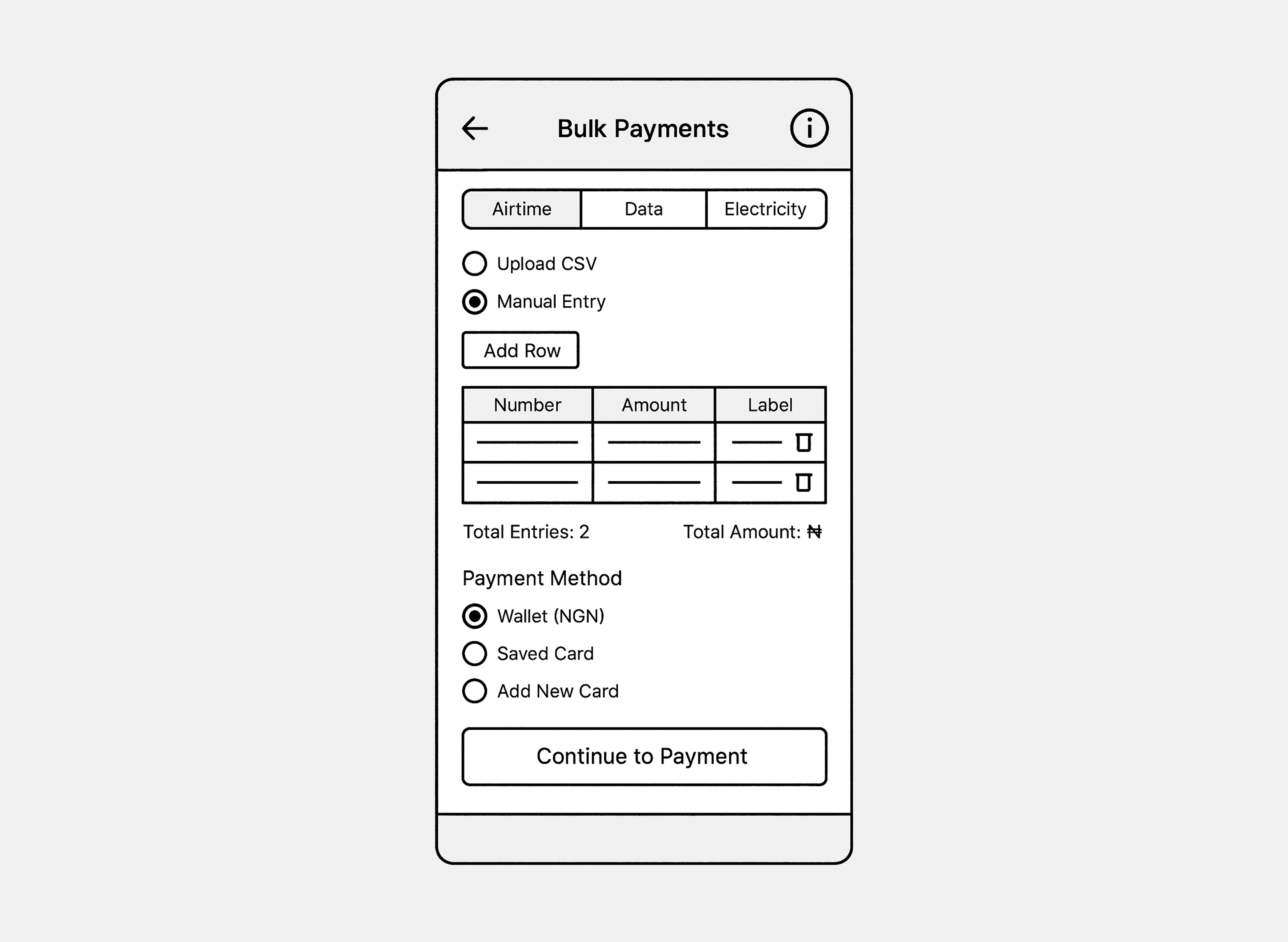
Bulk – Designed for users who wanted to perform bulk purchases of utilities such as airtime, data, or electricity for multiple recipients at once.
New Bill – The exploration and transaction section, where users can browse various service categories and initiate payments.
Reversal – A dedicated space for users to view reversal history or apply for reversals in case of failed or pending transactions.
Transactions – A chronological view of all past activities, including detailed receipts, filters, and export options.
There’s also a Profile section where users can manage their settings, KYC, and personal preferences.
This structure made the navigation logical and predictable, aligning with users’ mental models and reducing cognitive load.
I restructured the entire app into five key sections that improved clarity, accessibility, and task orientation:
Home – A central hub for quick actions, wallet balances, recent activities, blog posts, and general account overview.
Bulk – Designed for users who wanted to perform bulk purchases of utilities such as airtime, data, or electricity for multiple recipients at once.
New Bill – The exploration and transaction section, where users can browse various service categories and initiate payments.
Reversal – A dedicated space for users to view reversal history or apply for reversals in case of failed or pending transactions.
Transactions – A chronological view of all past activities, including detailed receipts, filters, and export options.
There’s also a Profile section where users can manage their settings, KYC, and personal preferences.
This structure made the navigation logical and predictable, aligning with users’ mental models and reducing cognitive load.
Branding & Visual Design
The company provided existing brand assets, including the logo, color palette, and core visual guidelines. My role was to align the product design with the established brand direction while maintaining usability and coherence across mobile screens.
However, I went beyond simple alignment—I curated additional visual assets such as banners, fliers, and covers to maintain consistency across both product and promotional touchpoints. These additions ensured the app felt truly unified with the broader Airbills Pay brand identity.

Brand Logo Icon |
Color & Typography
Color:
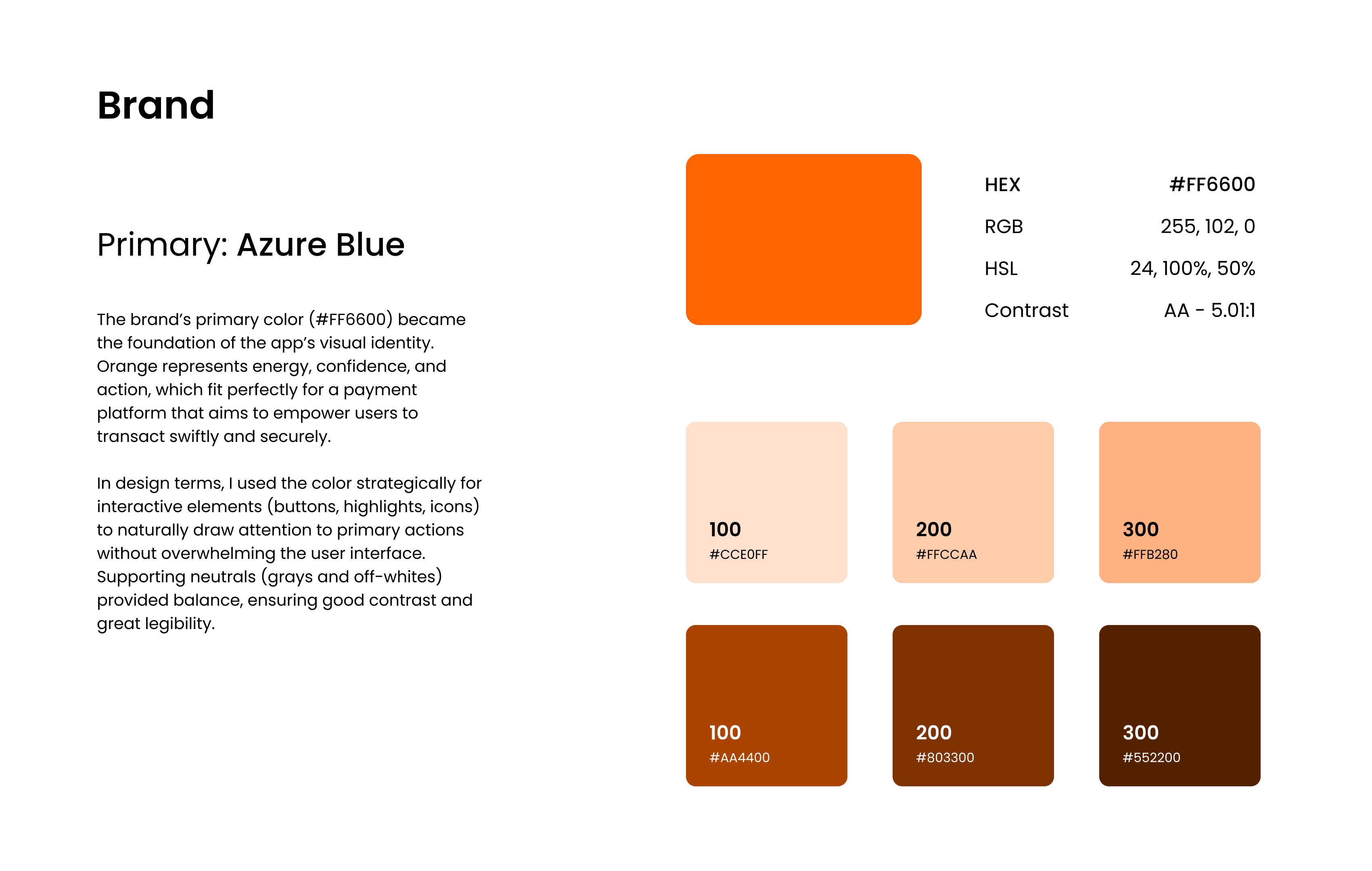
The brand’s primary color (#FF6600) became the foundation of the app’s visual identity. Orange represents energy, confidence, and action, which fit perfectly for a payment platform that aims to empower users to transact swiftly and securely.
In design terms, I used the color strategically for interactive elements (buttons, highlights, icons) to naturally draw attention to primary actions without overwhelming the user interface. Supporting neutrals (grays and off-whites) provided balance, ensuring good contrast and legibility.
Color:
The brand’s primary color (#FF6600) became the foundation of the app’s visual identity. Orange represents energy, confidence, and action, which fit perfectly for a payment platform that aims to empower users to transact swiftly and securely.
In design terms, I used the color strategically for interactive elements (buttons, highlights, icons) to naturally draw attention to primary actions without overwhelming the user interface. Supporting neutrals (grays and off-whites) provided balance, ensuring good contrast and legibility.
BRAND COLOR |
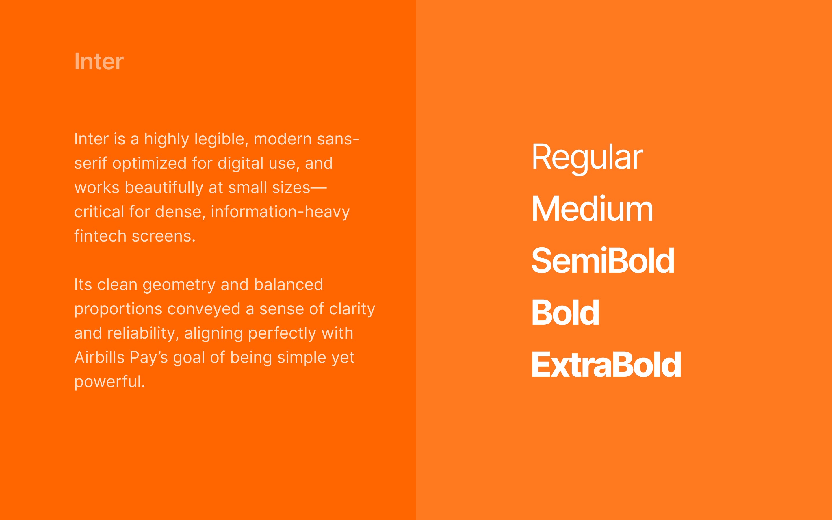
Typography:
I used Inter as the primary typeface for the interface. It’s a highly legible, modern sans-serif optimized for digital use, and works beautifully at small sizes—critical for dense, information-heavy fintech screens.
Its clean geometry and balanced proportions conveyed a sense of clarity and reliability, aligning perfectly with Airbills Pay’s goal of being simple yet powerful.
Font Family |
Design Execution
Once the foundational system was set, I moved into the visual design phase.
I built a comprehensive component library in Figma containing buttons, modals, cards, lists, form fields, and icon sets to ensure design scalability and visual consistency.
Each screen was structured to follow a clear visual hierarchy—ensuring users could quickly find what they needed without unnecessary exploration. I introduced:
Quick-access action cards on the home screen
Simplified form fields for repetitive tasks like utility payments
Distinct state indicators (loading, success, error) to improve feedback clarity
Micro-interactions and smooth transitions to give the app a sense of liveliness and responsiveness
Using AI in workflow:
Generated quick wireframe concepts
Produced placeholder copies & translations
Ran AI-based usability checks (detecting flow frictions)
This cut down hours of iteration and let me focus more on strategy & UX polish
The result was a clean, efficient interface that felt familiar yet elevated, with a strong visual rhythm that made information easier to scan and act upon.
Airbills Pay Hi-Fi Screens |
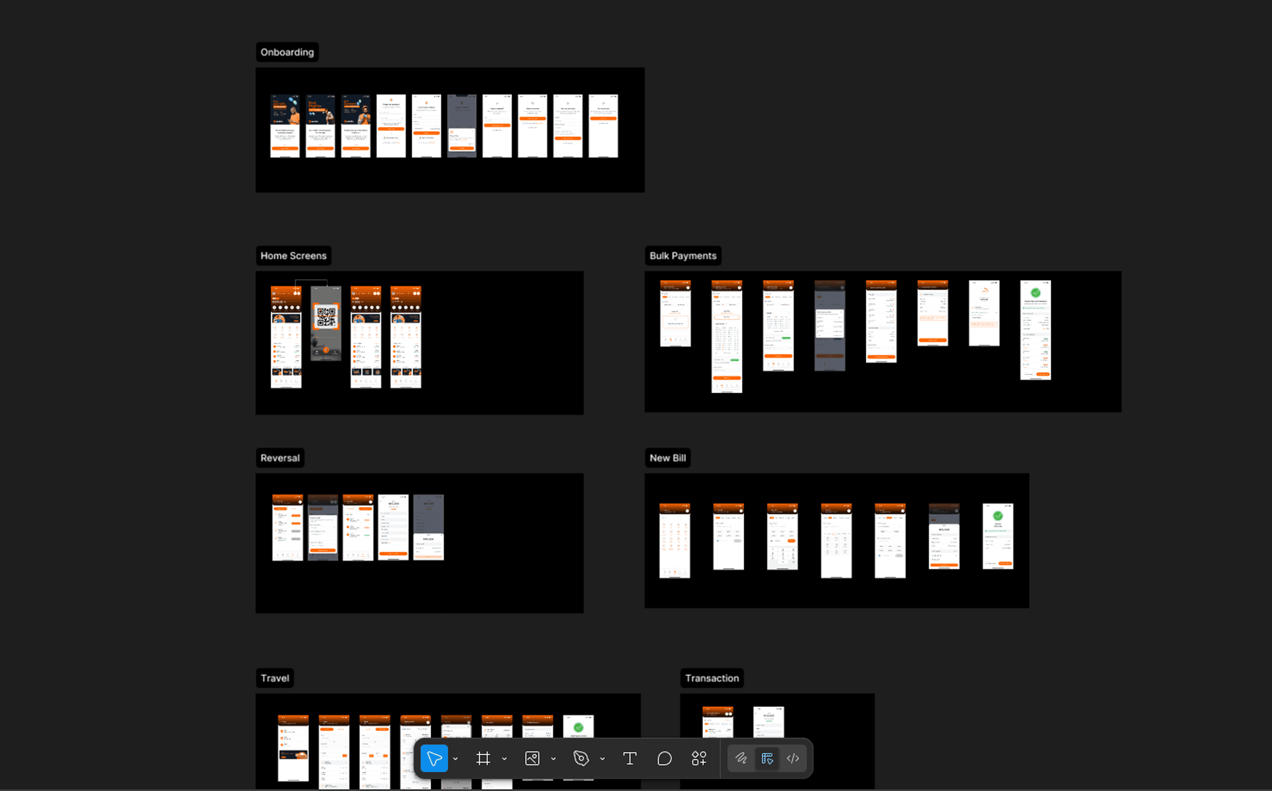
Snapshot of handoff file |
Testing & Iteration
Usability Testing
I conducted three rounds of usability testing—two moderated sessions and one remote. Participants included both existing Web3 users and new everyday users with no prior experience in crypto-based platforms.
Each session focused on key flows:
Buying airtime
Viewing wallet balance
Requesting a reversal
Exploring flight/hotel booking
The goal was to observe natural interactions and identify where users hesitated or needed additional visual cues.
Key Findings & Improvements
Form Simplification: Users preferred short, step-based forms for flight/hotel booking instead of long scrollable pages. I restructured the process into clear progress stages.
Reversal Clarity: Many users weren’t sure what the “Reversal” section meant at first. I added clearer labeling, tooltips, and in-context explanations.
Quick Pay: Introduced a “Quick Pay” card on the home screen for one-tap access to most-used services.
Feedback Enhancements: Added visual and textual feedback for success/failure states to increase trust and transparency.
Web3 Terms Simplified: Reworded certain crypto-related language to sound friendlier and easier to understand.
These changes collectively improved task completion time and user confidence across both user groups.
Challenges & Solutions
1. Introducing Flight & Hotel Booking on Mobile
Adding a full flight and hotel booking flow into a mobile payments app was unconventional, and users were skeptical about the complexity.
Adding a full flight and hotel booking flow into a mobile payments app was unconventional, and users were skeptical about the complexity.
Adding a full flight and hotel booking flow into a mobile payments app was unconventional, and users were skeptical about the complexity.
Solution:
I broke the process into bite-sized, sequential steps—destination → date → seat/room selection → summary—supported by visual progress indicators. I also added pre-filled defaults (like user details and saved cards) to speed up checkout. This modular flow tested significantly better in later sessions, improving task completion and reducing drop-offs.
2. Balancing Web3 and Regular User Experiences
The biggest challenge was designing an interface that appealed to both advanced Web3 users and regular users without alienating either side.
The biggest challenge was designing an interface that appealed to both advanced Web3 users and regular users without alienating either side.
The biggest challenge was designing an interface that appealed to both advanced Web3 users and regular users without alienating either side.
Solution:
I used a neutral design language—simple enough for new users but still sleek and futuristic for Web3 enthusiasts. Crypto features were contextual, not dominant. I also standardized visual cues and reduced jargon. The result was a balanced, inclusive interface that felt equally natural for both groups.
3. Communicating Complex Features Clearly
Features like reversals and wallet management carried technical complexity, and without careful design, they could easily confuse users.
Features like reversals and wallet management carried technical complexity, and without careful design, they could easily confuse users.
Features like reversals and wallet management carried technical complexity, and without careful design, they could easily confuse users.
Solution:
I designed contextual explanations using inline tips and subtle info modals that appeared only when needed. This approach gave users help at the right moments without cluttering the screens.
Solution:
I designed contextual explanations using inline tips and subtle info modals that appeared only when needed. This approach gave users help at the right moments without cluttering the screens.
Solution:
I designed contextual explanations using inline tips and subtle info modals that appeared only when needed. This approach gave users help at the right moments without cluttering the screens.
Final Outcome
The redesigned Airbills Pay app achieved a strong balance of clarity, inclusivity, and brand consistency. Users could navigate easily, complete tasks faster, and feel more confident using both the Web3 and traditional payment features.
Stakeholders highlighted the new design’s improved usability, brand alignment, and overall coherence as key wins.
Key Learnings
Designing for two distinct audiences requires empathy and balance—not compromise.
Usability testing with both experienced and inexperienced users yields invaluable insights.
Mobile experiences can successfully handle complex tasks when flows are structured around clarity and reassurance.
Designing for two distinct audiences requires empathy and balance—not compromise.
Usability testing with both experienced and inexperienced users yields invaluable insights.
Mobile experiences can successfully handle complex tasks when flows are structured around clarity and reassurance.
Designing for two distinct audiences requires empathy and balance—not compromise.
Usability testing with both experienced and inexperienced users yields invaluable insights.
Mobile experiences can successfully handle complex tasks when flows are structured around clarity and reassurance.
Conclusion
The Airbills Pay redesign reaffirmed one of my core design beliefs: great design bridges gaps—between users, technologies, and expectations.
By blending the simplicity that everyday Nigerians needed with the sophistication Web3 users expected, I created a product experience that felt modern, trustworthy, and delightfully seamless.